10,000 search results
(0.036 seconds)
- Space Walk by Olivetype,
$18.00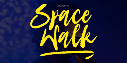 Space Walk is a dry brush handwritten script font. It is a nice choice for creating eye-catching logos, branding, and quotes. The font is supporting 66 languages, which include: Afrikaans Albanian Catalan Danish Dutch English Estonian Finnish French German Italian Norwegian Portuguese Spanish Swedish Zulu, and more. So what’s included: Basic Latin A-Z & a-z. Numbers, symbols, and punctuations. Ligatures . Multilingual Support. Accented Characters : ÀÁÂÃÄÅÆÇÈÉÊËÌÍÎÏÑÒÓÔÕÖØŒŠÙÚÛÜŸÝŽàáâãäåæçèéêëìíîïñòóôõöøœšùúûüýÿžß Thank You.
 - Miraversa by Caligrafê,
$15.00 Miraversa is a display font inspired by calligraphic capitals. It's a typeface with characters of remarkable width, delicate serifs, and beautiful contrast. Most of the letterforms are round, with generous curves. It works as charming drop caps, beautiful titles, and nostalgic compositions. You can use this font on book/cover title designs, product labels, logos, posters and stationery. Features: Basic Alphabet All Uppercase and Punctuation Numbers and Symbols Language Support
 - Maletha Collection Signature by Yoga Letter,
$13.00 "Maletha Collection" is a font duo that combines elegant serif fonts and beautiful signature fonts. This font is very nice and can be used for all kinds of your work. "Maletha Collection" is perfect for making banners, posters, prints, logos, stickers, social media, weddings, promotions, decorations, portraits, presentations, and others. This font is very complete, because it is equipped with basic characters, uppercase, lowercase, multilingual support, numeral and punctuation.
 - Retrotype by Luxfont,
$18.00 Introducing retro font Retrotype. Family's vintage style will suit both 50s-80s cartoon illustrations and wild west designs. Retro family has 2 types of styles, complete with different curves. Carefully constructed glyph shapes look great in both large amounts of text and single words in headings. Ideal for vintage and retro designs. Features: - Vintage style. - Uppercase and lowercase the same size. - Numbers & basic Punctuation. - 4 fonts in family. - Kerning. ld.luxfont@gmail.com
 - Rough Stone by Epiclinez,
$18.00 Rough Stone is a lovely and trendy hand brush font. It is a good choice for creating eye-catching logos, brandings, and quotes. This Font is supporting more than 66 languages, which include: Afrikaans Albanian Catalan Danish Dutch English Estonian Finnish French German Italian Norwegian Portuguese Spanish Swedish Zulu, and more. You will get : Basic Latin A-Z & a-z. Numbers, symbols, and punctuations Multilingual Support. Accented Characters : ÀÁÂÃÄÅÆÇÈÉÊËÌÍÎÏÑÒÓÔÕÖØŒŠÙÚÛÜŸÝŽàáâãäåæçèéêëìíîïñòóôõöøœšùúûüýÿžß Thank you
 - Sagira by Flawlessandco,
$9.00 Introducing "Sagira" - A Retro Display Font. Travel back in time with "Sagira," a nostalgic retro display font that pays homage to the past, complete with charming wavy line details that evoke a sense of vintage flair. There's some connected letters and some alternates that suitable for any graphic designs such as branding materials, t-shirt, print, business cards, logo, poster, t-shirt, photography, quotes .etc This font support for some multilingual. Also contains uppercase A-Z and lowercase a-z, alternate character, numbers 0-9, and some punctuation. If you need help, just write me! Thanks so much for checking out my shop!
 - Pumpkin Boy by PizzaDude.dk,
$14.00 October is the season for pumpkins - some of them are meant for soups, salad or other kinds of food. Others are cut into creepy looking pumpkinheads...and then there are the ones that are used for fun and games only! And that is exactly what this font is about! Pumpkin Boy is my laid back comic font with a jumpy x-height and crunchy lines. If you choose to write in uppercase only, the letters are a bit less funky, but still crunchy and great for headlines. I've added ligatures for double letters substitution for the most common letter combinations.
 - Whatzis JNL by Jeff Levine,
$29.00Whatzis JNL is a collection of over 85 decorative question marks gathered from the Jeff Levine font collection and assembled into one convenient file for use in specialty projects where ad copy is based on questions or curiosity. No need to search through dozens of fonts for your background images, as they're all here. Ads such as "Have a question about your insurance?," "What's New at Harper, Jones and Harper?" or "Ask Us! - We are the Experts!"... or signs saying "May We Help You?" benefit from some well placed display question marks - especially when printed in contrasting colors or screened-back in halftones. - Used Servers by AltaTech,
$17.99 Jump back to the future with both faces of the Used Servers family. This blocky titling font comes ready with ligatures and diacritics for all of your English, French, and German retro-future needs. Art Deco density combines with subtly-weighted horizontals for a slight 3D effect. As a retro omni-technical font with roots in OCR and n-segment displays, Used Servers is equally at home as: Titling in an 80s cassette-punk text adventure Environmental advertising in a cyberpunk megalopolis Art Deco filigree worked into a sacred orb Glyphs holding secrets from before time
 - Kaizena by MaxnorType,
$12.00 Kaizena is a modern script font with alternates, final form, stylistic sets, including front and back swashes. It can be used for various purposes, and suitable for logo design, branding, greeting cards, stationery, wedding invitations and much more. The design of Kaizena nuanced Japanese style, but it is very feasible to use in modern themed designs. Kaizena uses OpenType Features, so designers can access alternate glyphs easily with graphic design softwares. Besides that, these alternate glyphs are located in Private Use Area, so they can be accessed easily with Character Map, Babel Map, or font manager softwares.
 - FeggoliteHatched by Ingrimayne Type,
$4.95 The name FeggoliteHatched comes from the fact that it was created with the help of an old font manipulation program called Incubator Pro. It was an attempt to create a more conventional typeface from the odd monospaced font, FeggoliteMono. As a monospaced font, FeggoliteHatched could be considered a typewriter face, but no typewriter ever produced letters like these. The original version from 1994 is now the italic style and it has a leftward or back slant. The upright or plain version was added much later, in 2018. There is also a choppy upright version included in this family.
 - Borscena by IbraCreative,
$17.00 Borscena is a luxury classic serif font that exudes timeless elegance and sophistication. Its meticulously crafted letterforms feature exquisite, ornate detailing and graceful, high-contrast strokes, making it the epitome of refined typographic design. Borscena’s regal presence and intricate serifs harken back to the golden age of print, offering a sense of opulence and exclusivity, ideal for conveying a sense of prestige and tradition in branding, editorial, or decorative applications. This font stands as a symbol of timeless beauty and an embodiment of the grandeur of bygone eras, making it the perfect choice for projects seeking a touch of sophistication and sophistication.
 - Stiana by WDC Fonts,
$30.00 Stiana font is a venetian serif in modern design. The general idea was inspired by beautiful masterpieces of Nicolas Jensen and William Morris. Stiana holds fine, balanced readability of venetian serif, and both 21st century trends. Letterforms are expressive and bold enough to use font as display, but it also fits nicely for text. Stiana supports Western Europe, Cyrillic and Greek languages. Stiana is surely a good choice both for screen applications and print media. Its multipurpose spreads over package design, logos, headlines, body texts, stationary and back labels. Also very good for books and magazines.
 - ND Raster by NeueDeutsche,
$20.00 Transport yourself back to the year 1994, a time when MS DOS games ignited the imagination of an impressionable young boy. Enchanted by the pixelated wonders of that era, he embarks on a journey that will shape his creative destiny. As the boy loses himself in the captivating landscapes of Commander Keen, the strategic depths of Warcraft: Orcs & Humans, and the mysterious quests of The Secret of Monkey Island, a seed is planted in his mind. The beauty of these games' typography, crafted pixel by pixel, captivates his young heart and fuels a passion for design.
 - MyPimp by Type Associates,
$45.00 The concept of a bold connected script with a hand lettered feel has been on my bucket list for decades. I imagined a pretentious, ornate, swashy look, a variety of word-end embellishments, heaps of ligatures and underscores. It took a weekend workshop on Python Scripting at Type@Cooper in San Francisco reinforcing the smarts of Opentype to make it happen. Hand drawn on paper using broad pen strokes for reference, the design was the easy part. The real work was in the back-end and self-imposed rigorous testing. Download a comprehensive pdf User Guide at this link.
 - Cardillac by Hoftype,
$49.00 Cardillac, named after E.T.A. Hoffmann’s literary figure, refers back to classical Didonesque, yet presents unique details which set it apart from historic models by adding a new flavour. Its clarity, noble appearance and cool elegance predestine it for magazines and newspapers. The Cardillac Family consists of 14 styles, provides many features which allow its application for ambitious typography. It comes in OpenType format with extended language support. All weights contain small caps, ligatures, superior characters, proportional lining figures, tabular lining figures, proportional old style figures, lining old style figures, matching currency symbols, fraction- and scientific numerals, matching arrows and alternate characters.
 - Times New Roman PS Cyrillic by Monotype,
$67.99In 1931, The Times of London commissioned a new text type design from Stanley Morison and the Monotype Corporation, after Morison had written an article criticizing The Times for being badly printed and typographically behind the times. The new design was supervised by Stanley Morison and drawn by Victor Lardent, an artist from the advertising department of The Times. Morison used an older typeface, Plantin, as the basis for his design, but made revisions for legibility and economy of space (always important concerns for newspapers). As the old type used by the newspaper had been called Times Old Roman," Morison's revision became "Times New Roman." The Times of London debuted the new typeface in October 1932, and after one year the design was released for commercial sale. The Linotype version, called simply "Times," was optimized for line-casting technology, though the differences in the basic design are subtle. The typeface was very successful for the Times of London, which used a higher grade of newsprint than most newspapers. The better, whiter paper enhanced the new typeface's high degree of contrast and sharp serifs, and created a sparkling, modern look. In 1972, Walter Tracy designed Times Europa for The Times of London. This was a sturdier version, and it was needed to hold up to the newest demands of newspaper printing: faster presses and cheaper paper. In the United States, the Times font family has enjoyed popularity as a magazine and book type since the 1940s. Times continues to be very popular around the world because of its versatility and readability. And because it is a standard font on most computers and digital printers, it has become universally familiar as the office workhorse. Times?, Times? Europa, and Times New Roman? are sure bets for proposals, annual reports, office correspondence, magazines, and newspapers. Linotype offers many versions of this font: Times? is the universal version of Times, used formerly as the matrices for the Linotype hot metal line-casting machines. The basic four weights of roman, italic, bold and bold italic are standard fonts on most printers. There are also small caps, Old style Figures, phonetic characters, and Central European characters. Times? Ten is the version specially designed for smaller text (12 point and below); its characters are wider and the hairlines are a little stronger. Times Ten has many weights for Latin typography, as well as several weights for Central European, Cyrillic, and Greek typesetting. Times? Eighteen is the headline version, ideal for point sizes of 18 and larger. The characters are subtly condensed and the hairlines are finer." - Times New Roman Seven by Monotype,
$67.99In 1931, The Times of London commissioned a new text type design from Stanley Morison and the Monotype Corporation, after Morison had written an article criticizing The Times for being badly printed and typographically behind the times. The new design was supervised by Stanley Morison and drawn by Victor Lardent, an artist from the advertising department of The Times. Morison used an older typeface, Plantin, as the basis for his design, but made revisions for legibility and economy of space (always important concerns for newspapers). As the old type used by the newspaper had been called Times Old Roman," Morison's revision became "Times New Roman." The Times of London debuted the new typeface in October 1932, and after one year the design was released for commercial sale. The Linotype version, called simply "Times," was optimized for line-casting technology, though the differences in the basic design are subtle. The typeface was very successful for the Times of London, which used a higher grade of newsprint than most newspapers. The better, whiter paper enhanced the new typeface's high degree of contrast and sharp serifs, and created a sparkling, modern look. In 1972, Walter Tracy designed Times Europa for The Times of London. This was a sturdier version, and it was needed to hold up to the newest demands of newspaper printing: faster presses and cheaper paper. In the United States, the Times font family has enjoyed popularity as a magazine and book type since the 1940s. Times continues to be very popular around the world because of its versatility and readability. And because it is a standard font on most computers and digital printers, it has become universally familiar as the office workhorse. Times?, Times? Europa, and Times New Roman? are sure bets for proposals, annual reports, office correspondence, magazines, and newspapers. Linotype offers many versions of this font: Times? is the universal version of Times, used formerly as the matrices for the Linotype hot metal line-casting machines. The basic four weights of roman, italic, bold and bold italic are standard fonts on most printers. There are also small caps, Old style Figures, phonetic characters, and Central European characters. Times? Ten is the version specially designed for smaller text (12 point and below); its characters are wider and the hairlines are a little stronger. Times Ten has many weights for Latin typography, as well as several weights for Central European, Cyrillic, and Greek typesetting. Times? Eighteen is the headline version, ideal for point sizes of 18 and larger. The characters are subtly condensed and the hairlines are finer." - Times New Roman WGL by Monotype,
$67.99 In 1931, The Times of London commissioned a new text type design from Stanley Morison and the Monotype Corporation, after Morison had written an article criticizing The Times for being badly printed and typographically behind the times. The new design was supervised by Stanley Morison and drawn by Victor Lardent, an artist from the advertising department of The Times. Morison used an older typeface, Plantin, as the basis for his design, but made revisions for legibility and economy of space (always important concerns for newspapers). As the old type used by the newspaper had been called Times Old Roman," Morison's revision became "Times New Roman." The Times of London debuted the new typeface in October 1932, and after one year the design was released for commercial sale. The Linotype version, called simply "Times," was optimized for line-casting technology, though the differences in the basic design are subtle. The typeface was very successful for the Times of London, which used a higher grade of newsprint than most newspapers. The better, whiter paper enhanced the new typeface's high degree of contrast and sharp serifs, and created a sparkling, modern look. In 1972, Walter Tracy designed Times Europa for The Times of London. This was a sturdier version, and it was needed to hold up to the newest demands of newspaper printing: faster presses and cheaper paper. In the United States, the Times font family has enjoyed popularity as a magazine and book type since the 1940s. Times continues to be very popular around the world because of its versatility and readability. And because it is a standard font on most computers and digital printers, it has become universally familiar as the office workhorse. Times?, Times? Europa, and Times New Roman? are sure bets for proposals, annual reports, office correspondence, magazines, and newspapers. Linotype offers many versions of this font: Times? is the universal version of Times, used formerly as the matrices for the Linotype hot metal line-casting machines. The basic four weights of roman, italic, bold and bold italic are standard fonts on most printers. There are also small caps, Old style Figures, phonetic characters, and Central European characters. Times? Ten is the version specially designed for smaller text (12 point and below); its characters are wider and the hairlines are a little stronger. Times Ten has many weights for Latin typography, as well as several weights for Central European, Cyrillic, and Greek typesetting. Times? Eighteen is the headline version, ideal for point sizes of 18 and larger. The characters are subtly condensed and the hairlines are finer."
 - Times New Roman by Monotype,
$67.99 In 1931, The Times of London commissioned a new text type design from Stanley Morison and the Monotype Corporation, after Morison had written an article criticizing The Times for being badly printed and typographically behind the times. The new design was supervised by Stanley Morison and drawn by Victor Lardent, an artist from the advertising department of The Times. Morison used an older typeface, Plantin, as the basis for his design, but made revisions for legibility and economy of space (always important concerns for newspapers). As the old type used by the newspaper had been called Times Old Roman," Morison's revision became "Times New Roman." The Times of London debuted the new typeface in October 1932, and after one year the design was released for commercial sale. The Linotype version, called simply "Times," was optimized for line-casting technology, though the differences in the basic design are subtle. The typeface was very successful for the Times of London, which used a higher grade of newsprint than most newspapers. The better, whiter paper enhanced the new typeface's high degree of contrast and sharp serifs, and created a sparkling, modern look. In 1972, Walter Tracy designed Times Europa for The Times of London. This was a sturdier version, and it was needed to hold up to the newest demands of newspaper printing: faster presses and cheaper paper. In the United States, the Times font family has enjoyed popularity as a magazine and book type since the 1940s. Times continues to be very popular around the world because of its versatility and readability. And because it is a standard font on most computers and digital printers, it has become universally familiar as the office workhorse. Times?, Times? Europa, and Times New Roman? are sure bets for proposals, annual reports, office correspondence, magazines, and newspapers. Linotype offers many versions of this font: Times? is the universal version of Times, used formerly as the matrices for the Linotype hot metal line-casting machines. The basic four weights of roman, italic, bold and bold italic are standard fonts on most printers. There are also small caps, Old style Figures, phonetic characters, and Central European characters. Times? Ten is the version specially designed for smaller text (12 point and below); its characters are wider and the hairlines are a little stronger. Times Ten has many weights for Latin typography, as well as several weights for Central European, Cyrillic, and Greek typesetting. Times? Eighteen is the headline version, ideal for point sizes of 18 and larger. The characters are subtly condensed and the hairlines are finer."
 - Times New Roman Small Text by Monotype,
$67.99In 1931, The Times of London commissioned a new text type design from Stanley Morison and the Monotype Corporation, after Morison had written an article criticizing The Times for being badly printed and typographically behind the times. The new design was supervised by Stanley Morison and drawn by Victor Lardent, an artist from the advertising department of The Times. Morison used an older typeface, Plantin, as the basis for his design, but made revisions for legibility and economy of space (always important concerns for newspapers). As the old type used by the newspaper had been called Times Old Roman," Morison's revision became "Times New Roman." The Times of London debuted the new typeface in October 1932, and after one year the design was released for commercial sale. The Linotype version, called simply "Times," was optimized for line-casting technology, though the differences in the basic design are subtle. The typeface was very successful for the Times of London, which used a higher grade of newsprint than most newspapers. The better, whiter paper enhanced the new typeface's high degree of contrast and sharp serifs, and created a sparkling, modern look. In 1972, Walter Tracy designed Times Europa for The Times of London. This was a sturdier version, and it was needed to hold up to the newest demands of newspaper printing: faster presses and cheaper paper. In the United States, the Times font family has enjoyed popularity as a magazine and book type since the 1940s. Times continues to be very popular around the world because of its versatility and readability. And because it is a standard font on most computers and digital printers, it has become universally familiar as the office workhorse. Times?, Times? Europa, and Times New Roman? are sure bets for proposals, annual reports, office correspondence, magazines, and newspapers. Linotype offers many versions of this font: Times? is the universal version of Times, used formerly as the matrices for the Linotype hot metal line-casting machines. The basic four weights of roman, italic, bold and bold italic are standard fonts on most printers. There are also small caps, Old style Figures, phonetic characters, and Central European characters. Times? Ten is the version specially designed for smaller text (12 point and below); its characters are wider and the hairlines are a little stronger. Times Ten has many weights for Latin typography, as well as several weights for Central European, Cyrillic, and Greek typesetting. Times? Eighteen is the headline version, ideal for point sizes of 18 and larger. The characters are subtly condensed and the hairlines are finer." - Times New Roman PS Greek by Monotype,
$67.99In 1931, The Times of London commissioned a new text type design from Stanley Morison and the Monotype Corporation, after Morison had written an article criticizing The Times for being badly printed and typographically behind the times. The new design was supervised by Stanley Morison and drawn by Victor Lardent, an artist from the advertising department of The Times. Morison used an older typeface, Plantin, as the basis for his design, but made revisions for legibility and economy of space (always important concerns for newspapers). As the old type used by the newspaper had been called Times Old Roman," Morison's revision became "Times New Roman." The Times of London debuted the new typeface in October 1932, and after one year the design was released for commercial sale. The Linotype version, called simply "Times," was optimized for line-casting technology, though the differences in the basic design are subtle. The typeface was very successful for the Times of London, which used a higher grade of newsprint than most newspapers. The better, whiter paper enhanced the new typeface's high degree of contrast and sharp serifs, and created a sparkling, modern look. In 1972, Walter Tracy designed Times Europa for The Times of London. This was a sturdier version, and it was needed to hold up to the newest demands of newspaper printing: faster presses and cheaper paper. In the United States, the Times font family has enjoyed popularity as a magazine and book type since the 1940s. Times continues to be very popular around the world because of its versatility and readability. And because it is a standard font on most computers and digital printers, it has become universally familiar as the office workhorse. Times?, Times? Europa, and Times New Roman? are sure bets for proposals, annual reports, office correspondence, magazines, and newspapers. Linotype offers many versions of this font: Times? is the universal version of Times, used formerly as the matrices for the Linotype hot metal line-casting machines. The basic four weights of roman, italic, bold and bold italic are standard fonts on most printers. There are also small caps, Old style Figures, phonetic characters, and Central European characters. Times? Ten is the version specially designed for smaller text (12 point and below); its characters are wider and the hairlines are a little stronger. Times Ten has many weights for Latin typography, as well as several weights for Central European, Cyrillic, and Greek typesetting. Times? Eighteen is the headline version, ideal for point sizes of 18 and larger. The characters are subtly condensed and the hairlines are finer." - Times New Roman PS by Monotype,
$67.99In 1931, The Times of London commissioned a new text type design from Stanley Morison and the Monotype Corporation, after Morison had written an article criticizing The Times for being badly printed and typographically behind the times. The new design was supervised by Stanley Morison and drawn by Victor Lardent, an artist from the advertising department of The Times. Morison used an older typeface, Plantin, as the basis for his design, but made revisions for legibility and economy of space (always important concerns for newspapers). As the old type used by the newspaper had been called Times Old Roman," Morison's revision became "Times New Roman." The Times of London debuted the new typeface in October 1932, and after one year the design was released for commercial sale. The Linotype version, called simply "Times," was optimized for line-casting technology, though the differences in the basic design are subtle. The typeface was very successful for the Times of London, which used a higher grade of newsprint than most newspapers. The better, whiter paper enhanced the new typeface's high degree of contrast and sharp serifs, and created a sparkling, modern look. In 1972, Walter Tracy designed Times Europa for The Times of London. This was a sturdier version, and it was needed to hold up to the newest demands of newspaper printing: faster presses and cheaper paper. In the United States, the Times font family has enjoyed popularity as a magazine and book type since the 1940s. Times continues to be very popular around the world because of its versatility and readability. And because it is a standard font on most computers and digital printers, it has become universally familiar as the office workhorse. Times?, Times? Europa, and Times New Roman? are sure bets for proposals, annual reports, office correspondence, magazines, and newspapers. Linotype offers many versions of this font: Times? is the universal version of Times, used formerly as the matrices for the Linotype hot metal line-casting machines. The basic four weights of roman, italic, bold and bold italic are standard fonts on most printers. There are also small caps, Old style Figures, phonetic characters, and Central European characters. Times? Ten is the version specially designed for smaller text (12 point and below); its characters are wider and the hairlines are a little stronger. Times Ten has many weights for Latin typography, as well as several weights for Central European, Cyrillic, and Greek typesetting. Times? Eighteen is the headline version, ideal for point sizes of 18 and larger. The characters are subtly condensed and the hairlines are finer." - Eskapade by TypeTogether,
$53.50 The Eskapade font family is the result of Alisa Nowak’s research into Roman and German blackletter forms, mainly Fraktur letters. The idea was to adapt these broken forms into a contemporary family instead of creating a faithful revival of a historical typeface. On one hand, the ten normal Eskapade styles are conceived for continuous text in books and magazines with good legibility in smaller sizes. On the other hand, the six angled Eskapade Fraktur styles capture the reader’s attention in headlines with its mixture of round and straight forms as seen in ‘e’, ‘g’, and ‘o’. Eskapade works exceptionally well for branding, logotypes, and visual identities, for editorials like magazines, fanzines, or posters, and for packaging. Eskapade roman adopts a humanist structure, but is more condensed than other oldstyle serifs. The reason behind this stems from the goal of closely resembling the Fraktur style to create harmony in mixed text settings. Legibility is enhanced by its low contrast between thick and thin strokes and its tall x-height. Eskapade offers an airy and light typographic colour with its smooth design. Eskapade italic is based on the Cancellaresca script and shows some particularities in its condensed and round forms. This structure also provided the base for Eskapade Fraktur italic. Eskapade Fraktur is more contrasted and slightly bolder than the usual darkness of a regular weight. The innovative Eskapade Fraktur italic, equally based on the Cancellaresca script previously mentioned, is secondarily influenced by the Sütterlin forms — an unique script practiced in Germany in the vanishingly short period between 1915 and 1941. The new ornaments are also hybrid Sütterlin forms to fit with the smooth roman styles. Although there are many Fraktur-style typefaces available today, they usually lack italics, and their italics are usually slanted uprights rather than proper italics. This motivated extensive experimentation with the italic Fraktur shapes and resulted in Eskapade Fraktur’s unusual and interesting solutions. In addition to standard capitals, it offers a second set of more decorative capitals with double-stroke lines to intensify creative application and encourage experimental use. The Thin and Black Fraktur styles are meant for display sizes (headlines, posters, branding, and signage). A typeface with this much tension needs to keep a good harmony between strokes and counters, so Eskapade Black has amplified inktraps and a more dynamic structure seen in the contrast between straight and round forms. These qualities make the family bolder and more enticing, especially with the included uppercase alternates. The Fraktur’s black weights are strident, refusing to let the white of the paper win the tug-of-war. It also won’t give away its secrets: Is it modern or historic, edgy or amicable, beguiling ornamentation or brutish presentation? That all depends on how the radically expanded Eskapade family is used, but its 16 fonts certainly aren’t tame.
 - Roter Hoody by HansCo,
$15.00 Roter Hoody font is a retro serif and bold display font. You will get three types of fonts in this pack, Regular, Outline and Shadow version. Use this display font to add that special retro touch to any design idea you can think of! Very suitable for logotype, Stickers, Packaging design, Cricut Project, headlines, brand identity, t shirt or apparel industry, posters, magazines, books, YouTube, Instagram, websites, or any of your creative design projects. Enjoy!
 - Bermula by Typehill Studio,
$25.00 Bermula is a Contemporary, Classy, and Warm Serif typeface. Bermula has a Clean and Smooth details. The design was intended to improve upon the Legibility. Bermula included 16 Fonts. Regular and matching Italic, from Light to Black weight. Also included Variable Font support. OpenType features allow for the implementation of typographic such as Ligatures. and added Latin Language support. It’s a perfect choice for Branding, Magazines, Posters, Advertising, Print, Packaging, Headlines, Logos, Web Design etc.
 - Spindletop NF by Nick's Fonts,
$10.00One in the series of fonts called Whiz-Bang Wood Type, intended to be set large and tight. Spindletop’s ultra-condensed letterforms allow a lot of information to be packed into little horizontal space. Named for a famous East Texas oil field that made a lot of people rich in the early part of the twentieth century. Both versions of this font include the complete Unicode 1252 Latin and Unicode 1250 Central European character sets. - Numpty by Hanoded,
$15.00 Numpty is a word of Scottish origin and means ‘someone who, by speech or action, demonstrates a lack of knowledge’. I use this word quite often (as this world, unfortunately, seems to be full of numpties). And guess what? Now you know what it means, you can use it too! Hooray! Numpty is a fat, rounded display font. A little uneven, a little weird, but with enough panache to make your designs stand out.
 - Rasbern by Nasir Udin,
$29.00 Rasbern is a display serif typeface with high contrast and refreshing looks. Ranging from thin to black with italics, Rasbern offers many possibilities to be applied in many graphic or editorial projects. The lighter weights are suitable for short paragraph, and the heavier weights are perfect for headlines, perfectly suitable for display purpose such as branding, book covers, and web heading. Rasbern has extended latin character set that supports 200+ latin-based languages.
 - Sharpe by Mans Greback,
$29.00 Sharpe is a stylish serif typeface family. The type has been drawn by Måns Grebäck during 2018 and 2019. It is clear, sharp and has brave, lively letter forms but with a conservative backbone. The five font weights balance beautifully in contrast to each other, and each weight has an italic equivalent, totaling in ten styles from Thin to Black. Each style contains ligatures and support for a wide range of languages.
 - Primate by John Moore Type Foundry,
$20.00 Primate is a typeface family that works both as a display font for reading, casual and informal as it approaches the forms of nature, hence the name Primate. Primate's family comes in a full range of weights, from the thin Ultra Light to Heavy Black, all weights are also presented in italics and all have ornaments. Primate is a natural and fun to compose texts, giving the design work of a contemporary look.
 - Gathell by Alit Design,
$12.00 Introducing Gathell Typeface GATHELL font family consists of 13 families, from Thin to Black style. The elegant modern font creates a unique design and is sure to steal the eye of the design target audience. Besides being unique, the GATHELL font also has a luxury simple character that makes the design charming and luxurious. These a fonts are perfect for designs with the concept of elegant, luxury, romance, fashion and so on.
 - Voire by Creativemedialab,
$22.00 Introducing Voire is an Elegant stylish and playful modern serif family. Voire comes with two versions display and Regular, and it has 9 weights from thin to Black with tons of alternates and ligatures This modern pretty serif family is perfect for all sorts of elegant designs like wedding invitations, but can also work great for logo, branding, website font and headers, or product labels. It's easy to read and the alternates are visually interesting
 - Capitana by Floodfonts,
$49.00 Capitana is a Geometric Sans with humanistic proportions and open apertures. Distinct ascenders and pointed apexes with deep overshoot give it a cool beauty and classic elegance. Capitana is an ultimate allrounder with 9 weights from Thin to Black, well suited for striking headlines and particularly legible in small sizes due to its open forms. Capitana has a powerful opentype engine with small caps, tabular and oldstyle figures, arrows, alternate letters, fractions, subscript and superscript.
 - Terital United by Letterbox,
$80.00 The long and frustrating search for a dynamic, monoline script drew our attention to the lack of such a typeface. This prompted us to create our very own, Terital, named after the 1960s Italian overcoat advertisement that was the original reference point for its 2003 creation. Fearing the odd all-caps script setting, we cheekily designed Terital as a lowercase set. This limitation was revised in the 2011 version. Beautiful swash capitals were also added.
 - Oh Icons by Poważne Studio,
$19.00 Oh Icons is a family of 382 icons divided into three thematic sets. Each set contains 52 characters, plus alternate glyphs in Open Type Stylistic sets. Every icon can be used independently, but you can also merge them to design an adult or a baby figure, a nursery room or to dress a dog. Black backgrounds will let you colour your icons. Have fun and stay tuned for the new topics already in the works!
 - Mercury Script by Fenotype,
$35.00 Mercury Script is an action packed type family of three weights. Click on Swash, Contextual or Stylistic alternates in any Open type savvy application for plenty of extra grooviness and combine with Mercury Ornaments for superb results. Turn on Small Caps to activate a complete set of block capitals designed to go with the font. Mercury Script is based loosely on hand lettering found in a vintage lingerie advertisement, only containing the words “light control”.
 - Spektra by Type Salon,
$35.00 Spektra is a multi-script type family that combines 5 scripts: Latin, Cyrillic, Arabic, Greek and Hebrew. It is a variable font - ranging from backslant to italic axis. Its condensed and black shapes are combining the same style concept throughout every script. Progressive shapes contribute to expressing statements on bigger mediums. Spektra combines different locations, cultures and ideas as statements around the world and celebrates the differences among them. Awards • Modern Cyrillic 2021
 - Olimpico by MAC Rhino Fonts,
$59.00 The name of this typeface is a hymn to the Stadio Olimpico in Rome. The home arena to the World's most beautiful football club – AS ROMA. A club with many great players through the years. The biggest of them all, is already a living legend… Francesco Totti. The design is a 2-weight family perfect for elegant display work. The regular weight is more even in blackness while the bold weight carry more contrast.
 - Mithella by Lafontype,
$19.00 Mithella is a sans serif family with a pleasant touch. Some letters, especially linear ones, look normative like other rounded sans serifs, but the difference can be seen clearly in curved letters so that it gives a pleasant impression for each series of words. Mithella comes with eight weights ranging from thin to black to complement your design needs be it branding, blogging, logos, advertising, games, cooking, packaging, editorial and publishing, web and screen design.